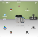
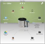
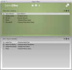
With Silent Sifter 2, you will see an all new user interface, tuned to make things more intuitive and easier on the eyes. In this post we will go through the key differences.
Other than the look and feel, here are some of the key differences:
- Addition of the ‘Start’ sift all button to the left of the sifter, to make it more readily apparent how to get things started.
- Movement of and increased detail in the progress bar. You will never again ask yourself ‘what is it doing?’ when a sift operation is going on.
- Addition of an input/output location shortcut menu. This menu allows you to directly partial sift, configure, open, or delete a location from the home screen.
[fusion_builder_container hundred_percent=”yes” overflow=”visible”][fusion_builder_row][fusion_builder_column type=”1_1″ background_position=”left top” background_color=”” border_size=”” border_color=”” border_style=”solid” spacing=”yes” background_image=”” background_repeat=”no-repeat” padding=”” margin_top=”0px” margin_bottom=”0px” class=”” id=”” animation_type=”” animation_speed=”0.3″ animation_direction=”left” hide_on_mobile=”no” center_content=”no” min_height=”none”]
There are also some minor changes that you will notice as well:
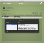
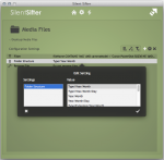
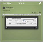
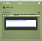
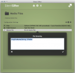
- The last 20 custom folder structure and file rename logic strings that you create are available to select the next time you select to configure folder structure/file renaming respectively. Just scroll down to the bottom of the list.
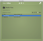
- Long path names are displayed with a ~ abbreviation of the home directory, if possible.
Last but not least, thanks to @alekswitko for reminding us that app development is not all about features, algorithms, and performance tuning. We were thinking about the UI in Silent Sifter 2, but your comments were what forced us to devote the time and energy it takes to make a UI great.
What do you think of the new User Interface? Let us know in the comments below.[/fusion_builder_column][/fusion_builder_row][/fusion_builder_container]
